Brand Identity - Process
Assignment A: Brief Part 1
1. Background
Manufacturer/Company
SPA is a brand of mineral water from Belgium that sells mineral water, flavored water, and fruit lemonades. SPA is owned by the Spadel Group and is very common in Western Europe. Their mission is to use pure and natural mineral water with 100% natural origin ingredients. Bottling is done at the source to ensure the purity of the water.
Description of Product
The item I have chosen is SPA Fruit lemon and cactus (lemonade). It’s a mix of carbonated natural mineral water, sugar, sweetener, and fruit juice concentrated from lemons, apples, and prickly pear cactus.
Current Strategy
SPA is an A-brand company in the Netherlands. They are extremely focused on sustainability. They are the first mineral water group in Europe that is 100% CO2 neutral. They also use 100% recycled plastic bottles (rPET) which can be recycled again. They want to work with distributors, waste collectors, and recycling institutions to introduce a deposit system for beverage packaging in the future. Their main target group include middle aged working class individuals and people who are proactive about their environmental impact.
Visual of the Product and Shop Section
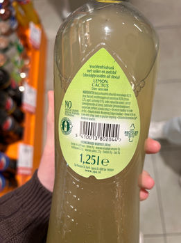
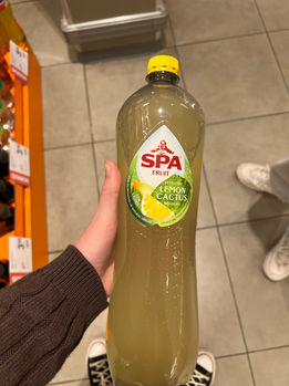
The bottle is a large, clear PET plastic that is 100% recyclable. The cap is yellow and there are two small sticker labels on the front and back in the shape of a water droplet. The SPA logo is large on the front label in bright red. The Lemon Cactus flavor is displayed as white text and visuals of lemon slices with cactus are on the bottom of the label. The middle of the bottle curves inward slightly and is slightly textured for grip.
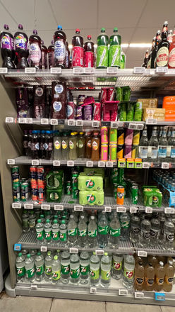
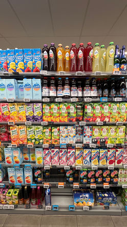
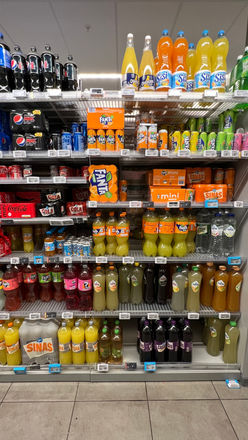
I found SPA lemonades in multiple sections of Albert Hein: The sparkling water section, the soda section, the juice section, and on drink end caps. These were on different level shelves each time as well. The majority of the time, SPA lemonade was on the bottom/middle shelves. The large bottle takes up the most space and is the dullest color. The large bottle is almost 2 euros while the smaller bottle is about 1 euro. There are multiple flavors, but none of them have much color to them. They are on an endcap in the main middle aisle of the store for the convenience of the customers.
Current Marketing Positioning

The Problem in Design and Packaging
The bottle is clear but the liquid is yellow/green so it looks unpleasant. The sticker with the brand information is small and the logo’s red color clashes with the yellows and greens of the flavor. The back label also doesn’t have much space for the brand’s message about sustainability and it is mostly filled with ingredients. When people see large, plastic bottles now, they tend to think it’s bad for the environment whether it’s recyclable or not. If this product is going to be the most expensive option on the shelf, there should be a more sustainable incentive to persuade more people to pay the extra amount. They are focused on working class supermarket individuals, but could benefit from shifting focus to college students and environmentalists because they align with the brand’s sustainable values.
2. Goals
In communication
-
Special Edition SPA Fruit Lemonades with reusable bottles.
-
Advertise the recyclability of the bottle and what the person should do to recycle since that is a big value for the brand. If the bottle is reusable, make that apparent.
-
Keep the ingredients, bottle size, and fine print on the back label. Include something about SPA’s 100% natural origin ingredients and possibly SPA’s Fruit drink slogan: “SPA Fruit as your healthy alternative.”
-
Communicate the main flavors visually and in the text on the front. The SPA Fruit logo must be on the front and apparent too, but can match with the rest of the design on the bottle.
-
The new design should catch the attention of shoppers but also be recognizable as a SPA product. It should be obvious visually that the bottle is reusable and environmentally friendly/sustainable.
In design
Non transparent, bigger cap, reusable, cap should be sturdy and easily resealable, add handle. Logo should just be the three letters to be cleaner and more modern. Add colorful fruit to emphasize fruit flavor vs regular SPA water. No neon colors because the drink should still feel natural and advertise the all-natural flavors.
-
Keep the famous logo but change the color so it doesn’t clash with the colors of the flavor.
-
Make the label larger to cover the majority of the bottle. Use colors that complement each other to market the special flavors but are not too bright to still reflect the natural ingredients in them.
-
People should feel environmentally conscious by choosing the reusable packaging over the single-use drinks beside it on the shelf. They should also feel encouraged to be a better person by reusing the bottle at least 5 times after the purchase. It should feel like an investment but a fiscally responsible purchase.
-
The shape of the bottle could change to stand out from the other bottles on the shelf. Make the drink look classier and more reusable than the other options. Include a handle for convenience, portability, and reusability.
-
Make the label “customizable” so people can choose to remove the sticker and reuse the bottle for other drinks in the future. This makes the consumer mentally feel like they bought the bottle for other drinks and not for a one-time drink. (Peel off to reveal a plain sticker or cute/neutral bottle design?)
In sustainability / sustainable packaging
Refillable, recyclable, reclosable, switch to plastic 2 (HDPE) to last longer.
-
Switch to HDPE (type 2) plastic because it is safer than PET plastic while reusing. It is also harder and more sturdy so it won’t get crushed. With safety concerns, type 2 has a low risk for chemical leaching that is lower than type 1. (Glass bottles are more difficult to recycle properly and they tend to get broken in transport.)
-
Make the recycle steps interactive and/or clear for the buyer on the bottle so they can be more enticed about actually recycling it. Use a QR code or steps/graphics to demonstrate what to do rather than just a recycle symbol.
In usability of the product or package
-
Make it easy to carry, hold, and open. If the bottle is convenient, sturdy, and feels like a two-in-one deal, it might persuade some people to reuse the bottle rather than recycle it or throw it away after one use. It would also persuade them to pay slightly more since it still feels like saving money in the long run.
Assignment B: Brief Part 2
3. Strategy and Positioning
Positioning in Market

New Positioning in Shop Segment
The position in the shop on the shelves is already ideal in the middle at eye-level. Even though the bottles may be “nicer” than the one-time use plastic bottles, the drink should still be a reasonable middle price and remain a trusted brand. Since SPA Fruit is currently in multiple locations with various types of drinks, it would be best to narrow it down to one section such as lemonade to limit competitors. We should also focus on placing these lemonades near registers, with the prepackaged meals, and stores like gas stations or Albert Heijn To-Go so they can be grabbed quickly and by our target audience.
4. Target Consumers

Emily Darling
“The greatest good is what we do for one another”
-
Age 21, a cafe barista, and a 2nd-year college student.
-
Hardworking student who is involved in extracurricular activities and has a minimum wage job outside of school. She’s more liberal and cares about the environment, equality, abortion rights, and health care.
-
Likes hiking, spending time with friends, traveling, and baking. Her planner is full and she is always busy doing something. She wants to work at the United Nations to help make a difference with public relations.
-
Motivated by her friends and family and her desire to explore the world. She doesn’t want a desk job and would rather be hands on and involved.

David Tillman
“A successful man is one who can lay a firm foundation with the bricks that others throw at him”
-
A tourist visiting Amsterdam with his wife for a week. He is a 55 year old white man who is a car salesman in America.
-
An extroverted conservative who analyzes things based on what will save him the most money. He is critical of the government and the economy.
-
Wants to be able to relax and feel like he’s living luxuriously, even though he tries hard to save money on the day to day. His goals are to retire comfortably and see his adult kids when he can. He is not too healthy and he and his wife enjoy going out to eat together.
-
David was motivated to send his kids to college, but now that they have gone to college, he is motivated by the thought of his vacation days and being able to stop working. He is afraid of losing all of his money or his home because he has worked hard to invest and spend his money wisely. He hopes to still be there for his wife and kids in the future.
5. Target Consumer Insight
Relation with Product
(how why when consumer uses product)
Emily wants to grab a refreshing drink to study with between work and her classes. She spots SPA lemonade while looking at the drink options because the reusable bottle stands out from the plastic bottles around it. She sees that the bottle has a handle and thinks it would be easier to carry for the day while she is out. She also cares about the environment and tries to do her part in the little ways she can, so she likes that she could refill the bottle with water later after she finishes the lemonade.
David is visiting Amsterdam with his wife for a week from America to visit their son who is there for work. After visiting some tourist sites on their first day, he and his wife stopped in a small supermarket (Albert Heijn To-Go) that they found walking in the city center to grab a quick snack and drink. He saw the SPA lemonade in the reusable bottle near the checkout and thought it would be nice to have with him as a water bottle for the rest of the trip. He forgot to pack his own and wanted a refreshment at that moment. He also thought it would be nice to save money this way rather than buying another water bottle in addition to this lemonade drink.
Relation with the Brand
(attitude towards the brand)
Emily has seen the brand name before being used by classmates. She has especially seen their water products and recognizes the logo. She doesn’t have much of an opinion, but she has heard from friends that the drink is good.
As a tourist, David has never seen the brand SPA before, but has noticed the logo at the few tourist stores and restaurants as plastic water bottles. He likes that they have another drink option such as lemonade and decides to try it because he’s seen a lot of SPA since arriving in Amsterdam.
Frustrations
(things to avoid, or things to find a solution for)
Both Emily and David need efficient and quick options. They need things that they can carry with them all day and which could be useful to them in the future. Otherwise, it will be thrown out immediately because they don’t have time to go out of their way to recycle the plastic bottle at the store again. Emily dislikes that most bottles are one-use plastics or glass because she thinks all brands should be more focused on helping the environment. She is annoyed with greenwashing and wishes corporations would focus more on global warming. David doesn’t like all of the fancy brands that cost a lot of money, but would still like to feel like he is living luxuriously.
Preferred Brands
Emily likes using eco friendly brands when she can such as patagonia, cliff bar, TOMS, and Lush. She also tries to go thrifting to avoid fast fashion at places like Primark.
David likes practical, everyday items and doesn’t tend to care how healthy they are. He also spends a bit more on trustworthy brands with high quality. He shops at places like Target and buys Polo, Coca Cola, Doritos, Coffee Mate, and Simply Lemonade.
Soft Spot
Emily likes creativeness and thoughtfulness that leaves a good impact. If she thinks using the product will help someone else, she will feel like she is doing a good deed.
David wants to feel successful, realistic and cost efficient. If the product is cheap in price, high in quality, and it will save him time and money in the future, then he is sold.
6. The Promise
Green, recycle, innovation, better life, convenient, quality.
7. USP/UVP/Advantages
USP (unique selling point):
The unique, reusable bottle that is visually smashing/fresh/tasty.
UVP (unique value proposition):
SPA is trying to make the world a better place by putting more sustainable options on the market.
Unfair Advantage:
SPA is a decades-long trusted brand (especially in the Netherlands).
Points of difference:
The only reusable bottle option on the shelf.
What Makes the Brand/Product Special Compared to Competitors
SPA is available everywhere and has many product options. They are also a well trusted brand that has a high persuasion in the drink market. If their sustainability in packaging is heightened, then competitors follow their lead and do the same with their packaging to compete. The products are clean and natural, plus they are handy to grab quickly when someone needs a drink. The price isn’t the highest price but also isn’t the lowest price.
8. The Proof
Rational
SPA Fruit lemon cactus - 1.89 euros at Albert Hein for 1.5 L
SPA Fruit lemon cactus Ingredients:
-
Carbonated natural mineral water 86.2% (source: Barisart)
-
fruit juices from concentrate 10.0% (lemon 5.3%, apple, prickly pear 0.1%)
-
sugar
-
natural aromas
-
sweetener (steviol glycosides from stevia)
-
stabilizer (locust bean gum)
-
concentrate (safflower)
-
acerola extract
Visual
Simple, water droplet, SPA logo centered on all products. All bottles have the same shape to be easily recognized as SPA. Photography on the website is light and feels natural. Usually shot outdoors. Most of the photos are taken somewhere green or in places we assume the water comes from. The texts are all simple san-serif, all letters are capitalized, and are mostly all the same color. SPA is bolded and a serif font.
9. Brand Architecture
The Product Range of the Brand
SPA has a branded house with names for the products such as SPA Fruit, SPA Reine, SPA Intense, SPA Finesse, and SPA Touch. SPA is a brand within a house of brands under Spadel.
10. Preconditions
Everything that Should be on the Package no Matter What
-
Keep the ingredients, bottle size, and fine print on the back label. Include something about SPA’s 100% natural origin ingredients and possibly SPA’s Fruit drink slogan: “SPA Fruit as your healthy alternative.”
-
Communicate the main flavors visually and in the text on the front. The SPA Fruit logo must be front and center, but can match with the rest of the design on the bottle.
-
Advertise the recyclability of the bottle and what the person should do to recycle since that is a big value for the brand. Explain how a bottle can be recycled (in icons) so if people decide they don’t want it anymore they can dispose of it well.
Restrictions in Redesign
-
Keep the three letters S P A but change the color so it doesn’t clash with the colors of the flavor and remove the man above. This should be a hip and sustainable spin-off logo for the special edition, but still recognizable as a SPA product.
-
The shape and quality of the bottle should change to stand out from the other bottles on the shelf. Make the bottle more reusable than the other options. Include a handle for convenience, portability, and reusability.
-
Make the recycle steps interactive and/or clear for the buyer on the bottle so they can be more enticed about actually recycling it. Use a QR code or steps/graphics to demonstrate what to do rather than just a recycle symbol.
-
Add a section on the label to check off the 5 times the bottle has been reused. This connects with the campaign funded by the government that sell the reduce, reuse, recycle behavior. This way, SPA hooks on to the government’s advertising and can spend less on trying to convince the public to do this.
-
The new design should catch the attention of shoppers but also be recognizable as a SPA product. It should be obvious visually that the bottle is reusable and environmentally friendly/sustainable.
3 Items to Redesign
3 flavors of SPA Fruit lemonades such as strawberry and blueberry, grapefruit and raspberry, or orange as well as the lemon cactus flavor.
Strategy Brand Essence
“Our all natural special edition SPA fruit lemonades are perfect for anyone who wants convenience on the go.”

Typography
The SPA logo font should remain the same, but the flavor titles and information text need different fonts. I think a bold, clean looking font for the flavor will pair with the thick, traditional serif font SPA is best. It could either be rounded and thin to contrast the SPA logo, or be thicker with small serifs as well in a slightly different font. The paired information font should pair well with the title, be easy to read, and feel trustworthy. If the title font has rounded edges, the smaller font should be rounder as well. By using the typewriter typeface or a sans serif font that isn’t as simple as say Arial, the information feels more original.
Assignment C: 3 Directions/Kitchen Review
All three of my directions involve switching the packaging to a different milk carton shape that one drinks out of by unfolding the top, and adding an exterior box to carry the six cartons rather than wrapping them in plastic.
For my first direction, I thought back to my memories with kids milk at lunch in the school cafeteria. We used to have small games or riddles on the side of the carton to keep us entertained. I thought about the fun "dairy" fonts I've seen in the past and colors I usually had on the cartons at school.
For the second direction, I wanted to convey the health of the product and refer to the Dutch meadows that are full of cows. I picked a color palette that matches this look and connects with the original colors of the packaging. I also pictured this with a rough sketch-like handwriting to give an organic feel and wanted the primary focus to be about the health of the product.
For the third direction, I thought about creating a barn for the carrier box and making the milk cartons cows inside of the barn. I wanted to make this barn a little playhouse for kids as well. I pictured a red barn with black and white cows and when trying to visualize how this would work realistically, I pictured a box similar to a McDonalds Happy Meal. I also wanted to use a handwritten typography inspired by the cows used in Chick-Fil-A ads.
In the end, I went in the third direction and created a carrier box designed as a barn and the cartons designed like cows. However, I used a color palette more similar to the second direction to still represent the natural ingredients and Dutch origin.
